具体制作步骤:
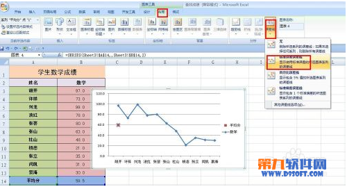
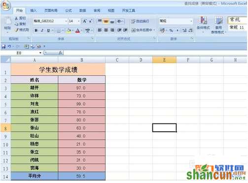
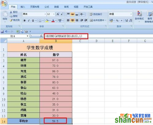
1、我们先导入一张学生的数学成绩表格,在平均值B14单元格中输入=ROUND(AVERAGE(B3:B13),1)。如图所示。
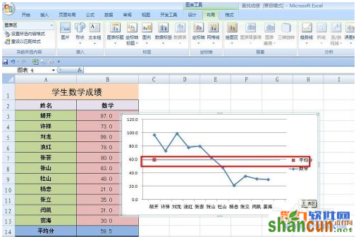
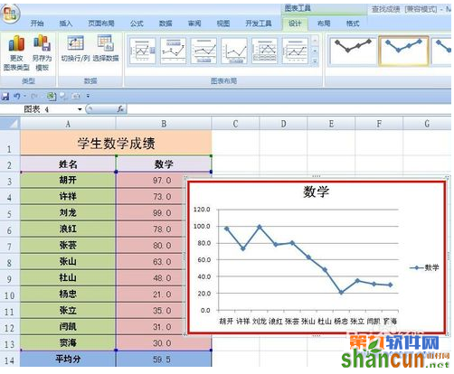
2、选择A2:B13单元格区域,选择插入——图表——折线图,出现如图所示的折线图。

3、现在我们来制作平均值线,右击图表——选择数据,弹出对话框,单击添加按钮,弹出“编辑数据系列”对话框,在“系列名称”中输入=Sheet3!$A$14,在“系列值”中输入=Sheet3!$B$14,单击确定。


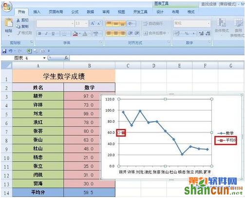
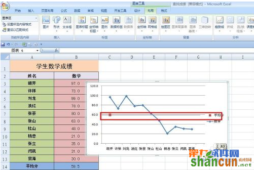
4、右击图表中“平均分”数据点,在右键菜单中选择“更改系列图表类型”,弹出“更改图表类型”对话框,将“平均分”的图表类型改为“散点图”。单击确定。

5、选定“平均分”数据点,选择布局——误差线——其他误差线选项,弹出对话框,选择水平误差线,选择正负偏差,无线端。“误差量”选择自定义,把正误差值=11,负误差值=1,单击确定,单击“线条颜色”,设置为实线,选择一种颜色。单击确定,就可以看到平均分线了。