1、创建图表,首先我们得准备数据,简单输入实际与预测两行数据,选中数据区域,单击菜单栏--插入--柱形图,选择二维柱形图中的簇状柱形图。

2、图表插入之后,右键单击蓝色表示预测的柱形,从弹出的右键菜单中,选择设置数据系列格式。
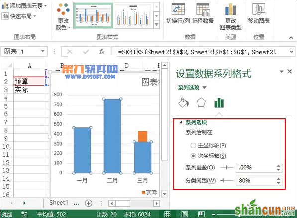
3、右侧弹出设置数据系列格式窗格,勾选将系列绘制在次坐标轴,系列重叠0%,分类间距80%。
4、在填充选项中,勾选无填充,继续下拉滚动条。

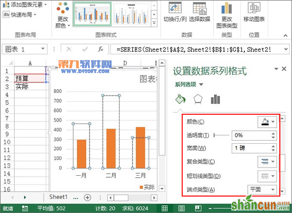
5、颜色设置为黑色,粗细为1磅,选择第三种短划线类型,断点类型为平面。
6、最后,我们删除右侧的坐标轴,修改图表标题,将图例放置在图表上方即可。