操作步骤:
1、首先,建立一个简单的表格数据,包含姓名以及各个月份的销售情况,选中表格区域,单击菜单栏--插入--折线图,选择二维折线图中的第一种即可。
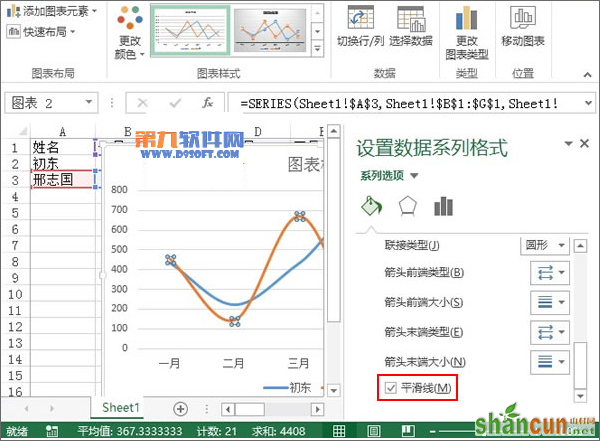
2、折线图生成之后,鼠标右击蓝色的折线,从弹出的右键菜单中选择设置数据系列格式。
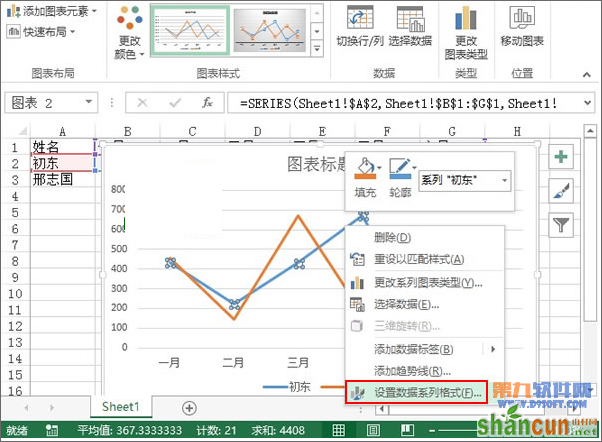
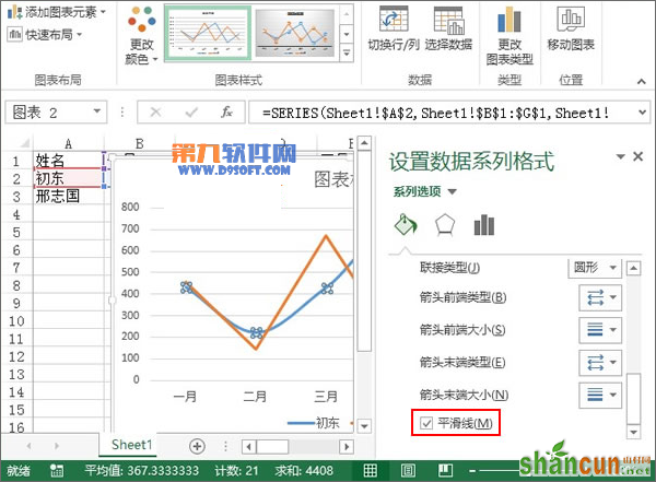
3、弹出设置数据系列格式窗格,下拉滚动条,在系列选项中勾选“平滑线”。
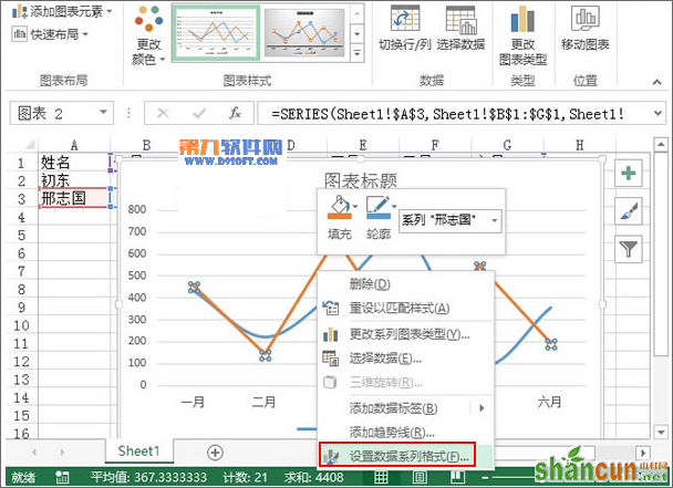
4、同样的,也是单击选中黄色折线,右键单击,设置数据系列格式。
5、勾选平滑线,目的是将由直线构成的折线变为弯曲状,类似于正弦余弦那样。
6、单击曲线上的一个顶点,也就是图形最高处,该处表示最大值,在设置数据点格式窗格中,勾选内置,类型圆点或者其他,大小为6。
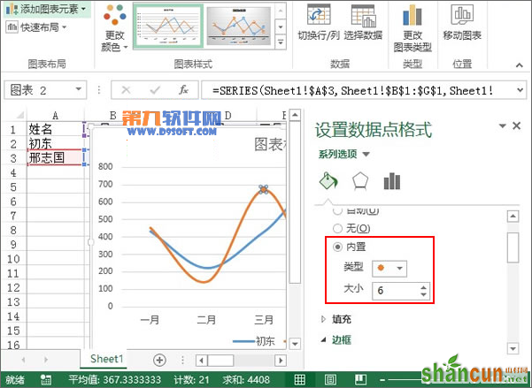
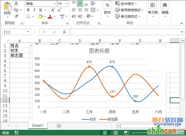
7、重复步骤6,在蓝色和黄色的曲线上分别进行操作,如下图所示。
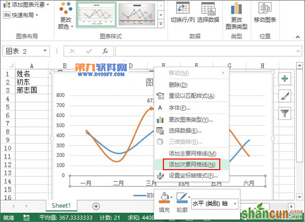
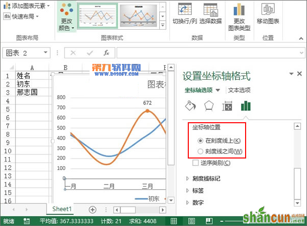
8、然后鼠标右键单击横坐标轴,右键菜单中选择添加次要网格线。
9、将坐标轴的位置勾选在刻度线上,关闭窗格。
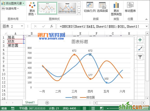
10、取消一些不必要的东西,图例设置在图表下方,最后的效果,大家可以查看下面的图。
注:更多精彩教程请关注山村办公软件教程栏目,山村电脑办公群:189034526欢迎你的加入