单个坐标轴大家都会做,双坐标轴可能还有些人不会做。最近,小编刚好在做双坐标轴的图表,跟大家分享一下经验。
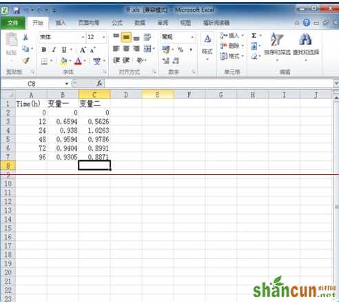
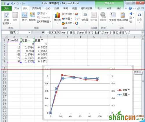
步骤一:首先,打开excel,输入数据,可以输入多个变量,按照你的要求来即可。
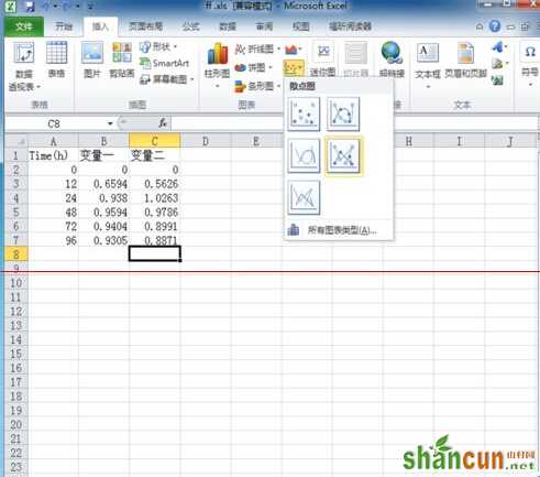
步骤二:点击插入,选择图表,这里选择的是带直线和数据标记的图表,如果想要其他图表形式,可以自由选择。
步骤三:然后双击图中箭头所示的数据线
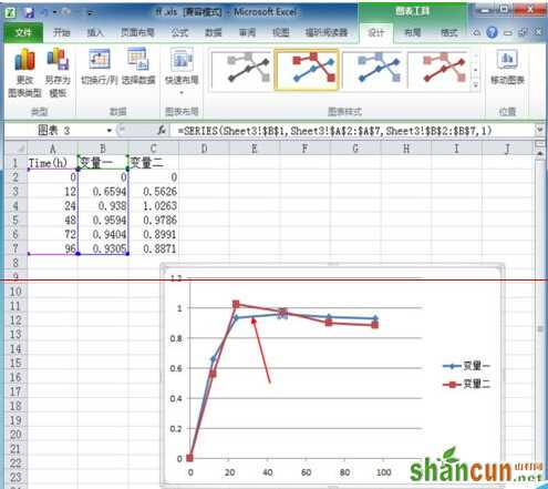
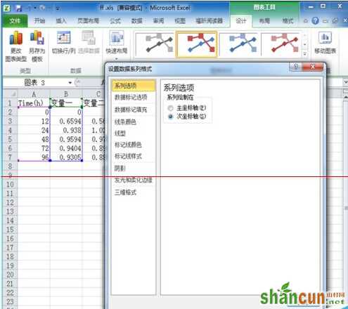
步骤四:选中次坐标轴,然后回过来看,双坐标轴就做好了
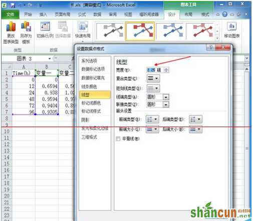
步骤五:如果想改变线条的粗细,同样,双击数据线,出现跟之前选次坐标轴一样的的窗口,点击线型,然后在箭头所示的地方可以更改线条粗细。
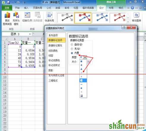
步骤六:如果觉得标记点难看的话,也可以改,同上,双击数据线。点击数据标记选项。点击内置,选择你喜欢的标记类型及大小。
注意事项:跟其他office版本可能有一点差别。