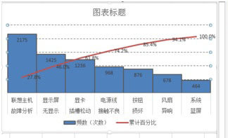
excel中制作柏拉图的教程:
制作柏拉图步骤1:选中数据区域——点击插入——推荐的图表——簇状柱形图。


制作柏拉图步骤2:点击图表工具(格式)——系列“累计百分比”——设置所选内容格式——次坐标轴。
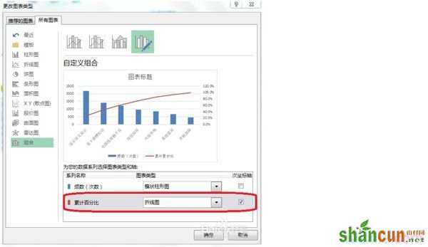
制作柏拉图步骤3:右击——更改系列数据图表类型——累计百分比(折线图)。
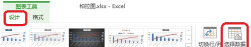
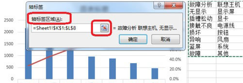
制作柏拉图步骤4:点击图表工具(设计)——选择数据——轴标签区域(如图所示,把原来的拆分成两列,是柏拉图的横坐标轴的数据显示如图所示)

制作柏拉图步骤5:调整分类间距
如图所示,双击——设置数据系列格式——分类间距(0)。
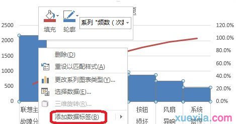
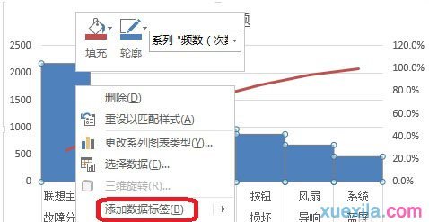
制作柏拉图步骤6:右击——添加数据标签
制作柏拉图步骤7:双击网格线进行设置,如图所示。