如何用excel设置xy轴的教程:
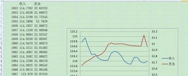
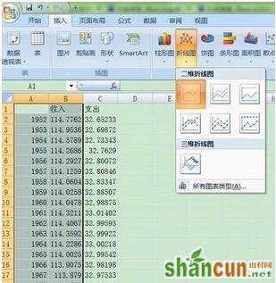
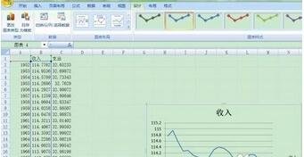
教程1:有表如下图,做出以年份为X轴,收入支出为左边和右边的Y轴,做出关于年份和收入的折线图,步骤如下图,结果如下图:
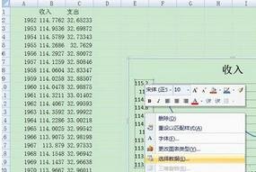
教程2:.然后,右击收入的Y轴坐标,点击“选择数据”,
教程3:在弹出的对话框中点击“添加”
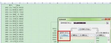
教程4:再在弹出的对话框中点击“支出“,选择支出那一列数据
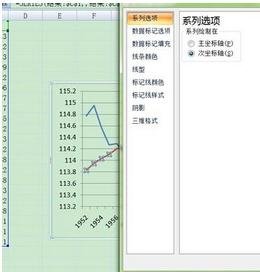
教程5:得出的图如下,然后在支出的图例上(注意只能是支出的图例不能选中支出和收入的图例)右击选择”设置数据系列格式“

教程6:在弹出的对话框中选择”次坐标轴“
教程7:点击关闭 即可 步骤中很多确定和按enter的步骤即可。