你多久没学习图表了呢?手痒了吗?今天来一个炫酷必杀技,大家跟我一起练练手哈!
(本教程使用Excel2013版本)
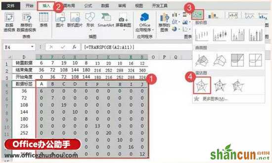
模拟一组随机数据:

最终效果:

步骤一:构建数据区域
公式输入:
选中E1:N1单元格区域,输入多单元格数组公式
=TRANSPOSE(B2:B11)
注意需要按CTRL+SHIFT+ENTER三键结束
这里使用公式,目的为跟随数据源数据变化,如果不会公式,可以直接复制数据源,然后选择性粘贴→转置。
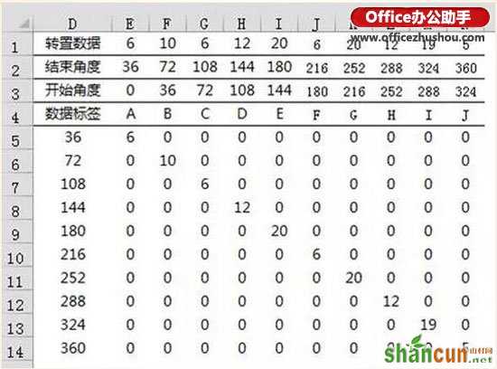
E2:N2区域直接计算每个点占多少角度,一个圆为360度,此处有10个分类,所以一个点占36度。
E3:N3开始角度与结束角度同理,一个点从0度开始,到36度结束,第二个点从36度开始,到72度结束,以此类推。
选中E4:N5单元格区域,输入多单元格数组公式
=TRANSPOSE(A2:A11)
同样需要按CTRL+SHIFT+ENTER三键结束。
D5:D14区域为开始角度转置后效果。
E5::N14区域公式为
=IF(($D5>E$3)*($D5<=E$2),E$1,)
公式右拉下拉。
步骤二:插入雷达图
选中“E4:N14”区域,插入雷达图。
插入图表后,依次单击“图表标题”、“图例”、“网格线”按DELETE键删除:

步骤三:添加数据
单击图表,右键“选择数据”,单击“添加”按钮。
系列名称为“圆环”,系列值为“={1,1}”,同样的步骤添加四次。
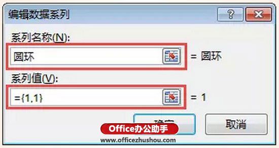
再添加一个系列,系列名称为“中心点”,系列值为“O1”单元格引用,添加后在“O1”单元格输入0。
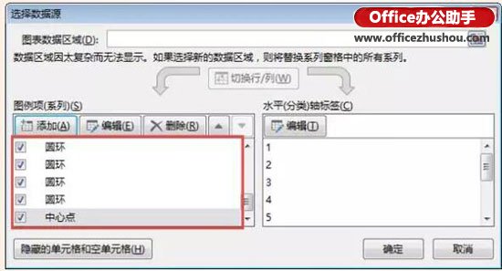
添加后选择数据源窗口如图:
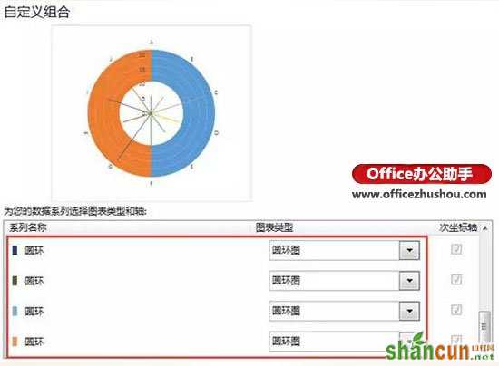
步骤四:更改图表类型
单击图表任意系列右键“更改系列图表类型”,将四个圆环系列更改为“圆环图”。
步骤五:设置图表格式
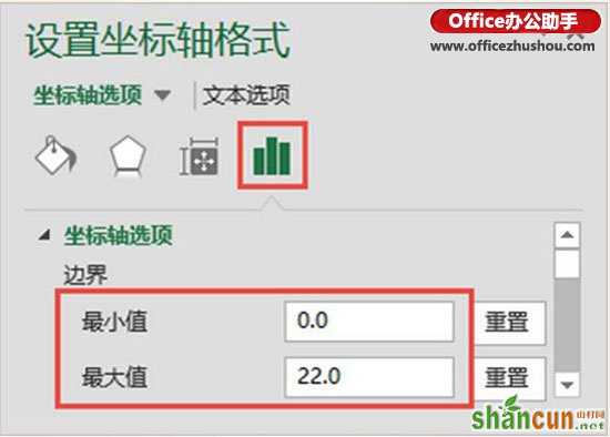
选中雷达图“纵坐标轴”设置坐标轴边界,最大值为22,最小值0,设置后按DELETE键删除纵坐标轴。
选中圆环图,设置圆环图“第一扇区起始角度”为90,“圆环图内径大小”为90。
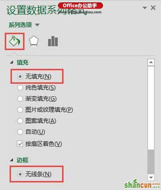
选中内三层圆环,设置无填充无线条。
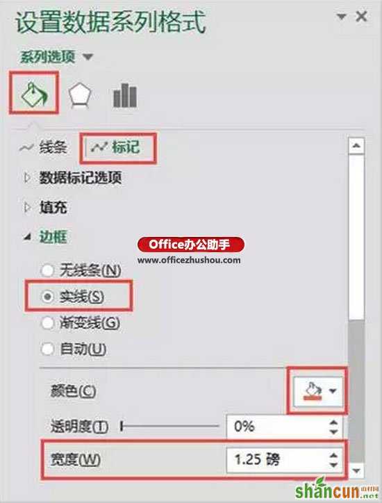
设置雷达系列线条格式,(设置时刻按F4快速重复上一次操作)。
设置后效果如图:

选中“中心点”系列,设置系列标记格式
设置后效果:

最后添加你的说明文字与标题即可。
思考:如果想要数据超过一定数量后,线条颜色变粗或者变色该怎么做?