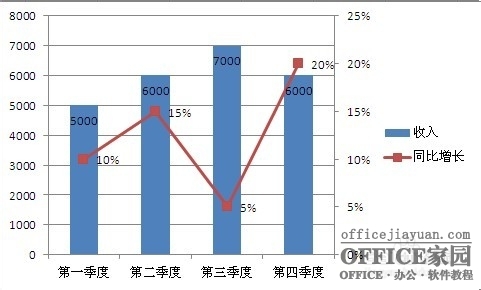
Excel图表应用十分广泛,主次坐标轴也是图表制作中的常客,因为2种数据的不同对比,无法在一个坐标轴上体现,那么次坐标轴就显得尤为重要,能更加清晰直观的显示。那么我们看下具体是怎么实现的呢?
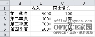
方法/步骤 首先打开所要建立图表的excel工作表,数据与自己的表格数据对照设计。
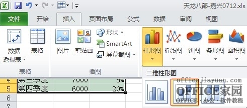
全选数据然后点击插入柱形图;
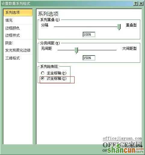
右键红色柱形图(即同比增长数据)选择‘设置数字系列格式’
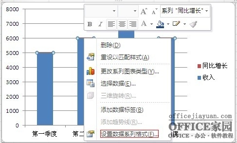
选择次坐标轴
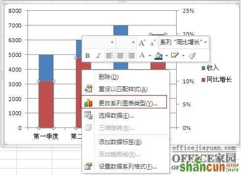
右边出现次坐标轴,由于图表感觉不美观,右键红色图表选择‘更改系列图表类型’
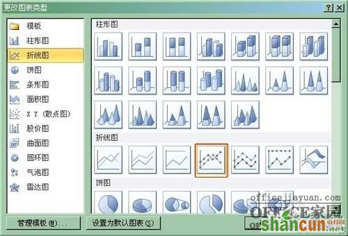
选择折线图中红色选择图表类型
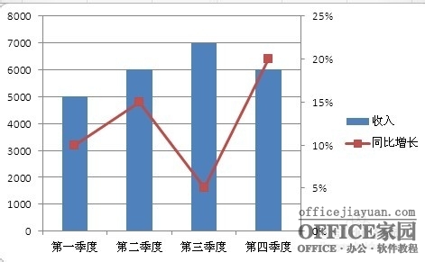
此时要建立的图表结构已经形成,增加数值的显示更加贴切
右键柱形图和折线图选择‘添加数据标签’,调整下数值的位置就显示完整的图表了