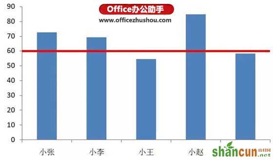
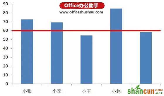
今天跟大家分享的excel图表制作技巧可以达到下图所示的效果,这样谁达到目标,谁没达到目标就一目了然:
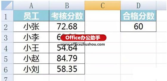
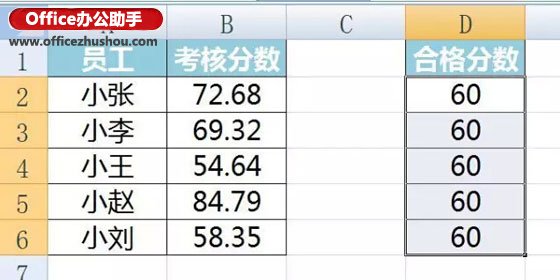
假设我们手上有下面一组数据:
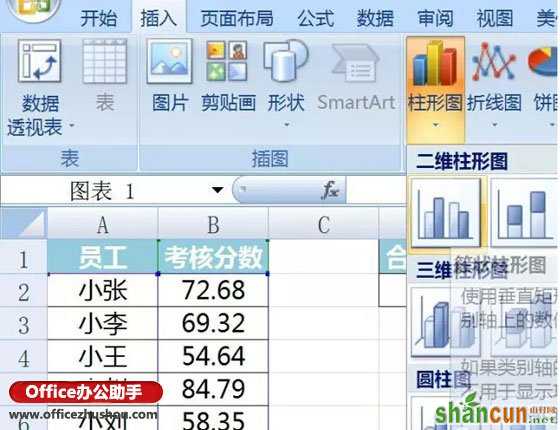
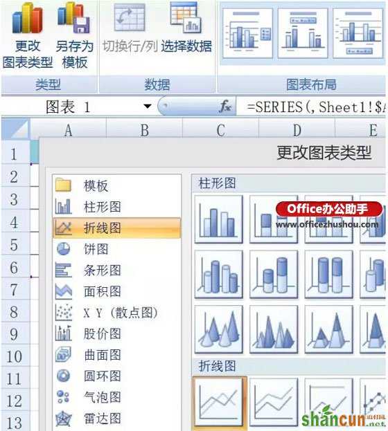
我们选中A、B列数据,点击插入——柱形图,选中二维柱形图:
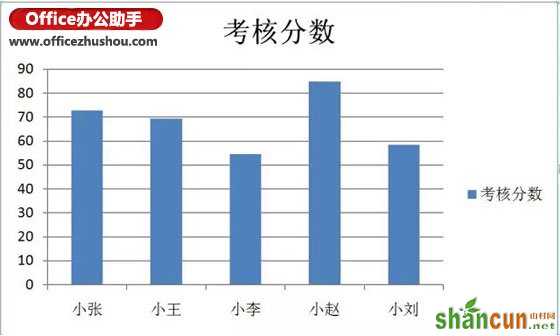
此时会出现下图所示的柱形图:
将合格分数复制到D3-D6单元格
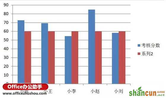
复制D2:D6单元格,点击柱形图区域,按ctrl+v粘贴,出现如下图形。
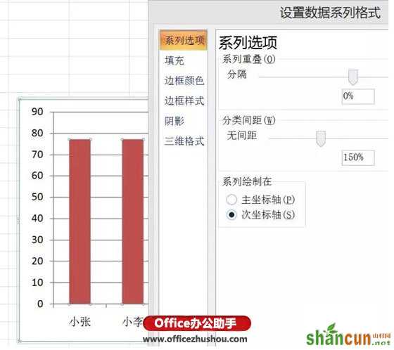
右键单击系列2的柱形,选择设置数据系列格式,在系列选项中选择次坐标轴
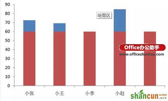
删除网格线、图例、和右侧的次坐标轴,呈现以下效果
双击系列2,选择左上角更改图标类型,选择折线图,然后确定。
单击红线,选择布局——趋势线——线性趋势线
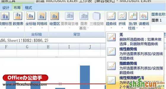
选择布局中的趋势线,设置趋势线,将预测前推后推0.5个周期。
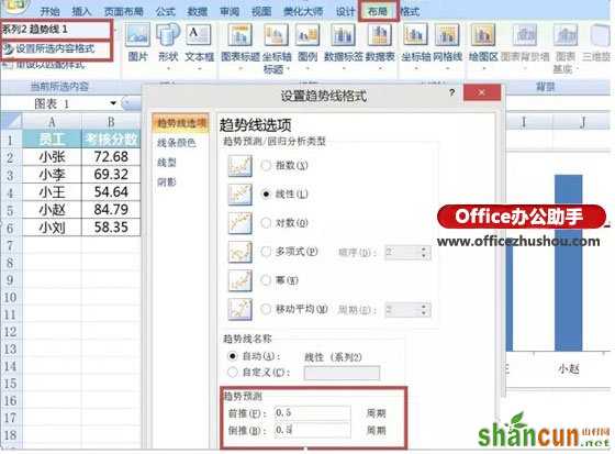
同样在上面界面选择线条颜色,点击实线、红色,最后选择线性,将宽度调为2.75磅,就达到最终效果了。