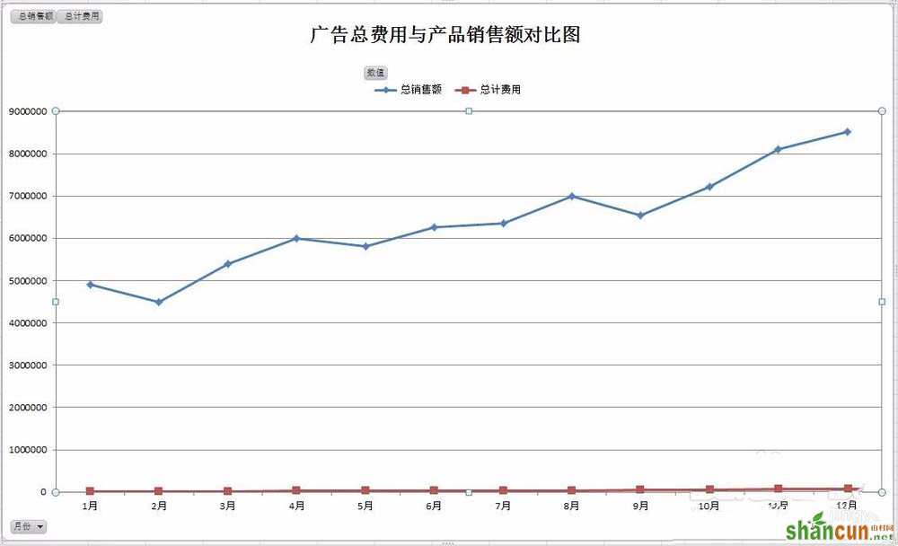
1、总销售额和总计费用在数值大小差异过大,如果做在同一张图表共用一个坐标轴,数据将无法正常显示,此时我们需要用两个坐标轴分别表示两组数据,如图下所示:
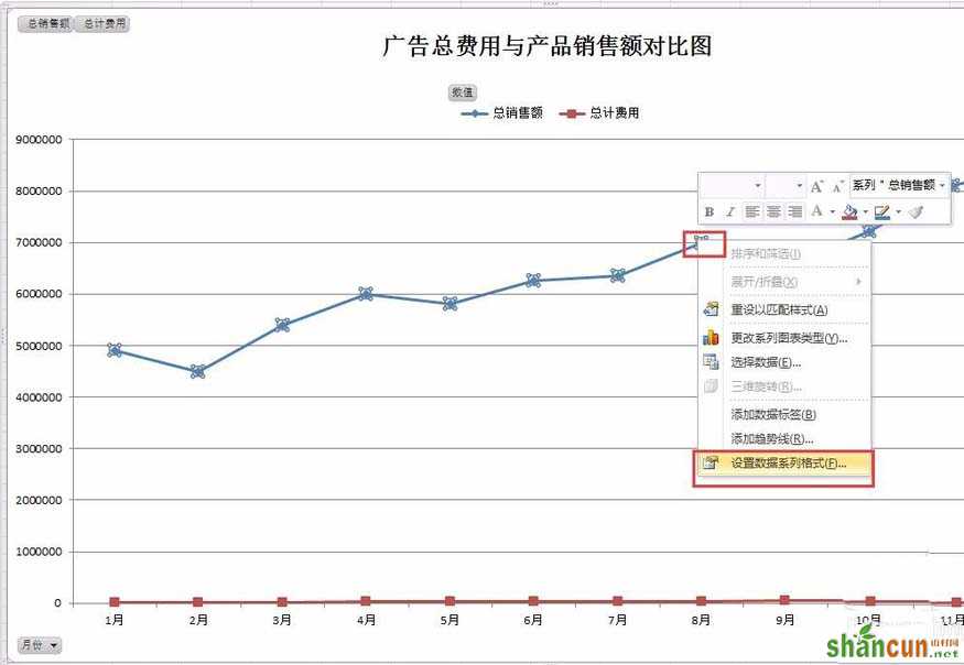
2、选中“总销售额数量”线(蓝色线条),鼠标右键单击,然后选择“设置数据系列格式”。如图下所示:
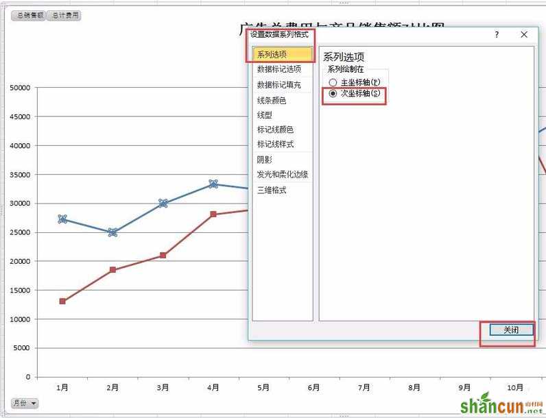
3、打开“设置数据系列格式”对话框,在“系列选项”,选项区域中选中“次坐标轴”单选按钮,最后点击“关闭”。如图下所示:
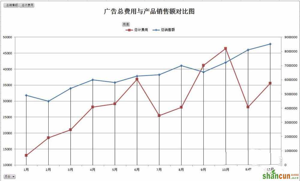
4、这样就在刚才的图表中又添加了一个坐标轴,“数量”的变化也很清晰可见,这就是双坐标轴的优点,看看有什么效果的差别。如图下所示:
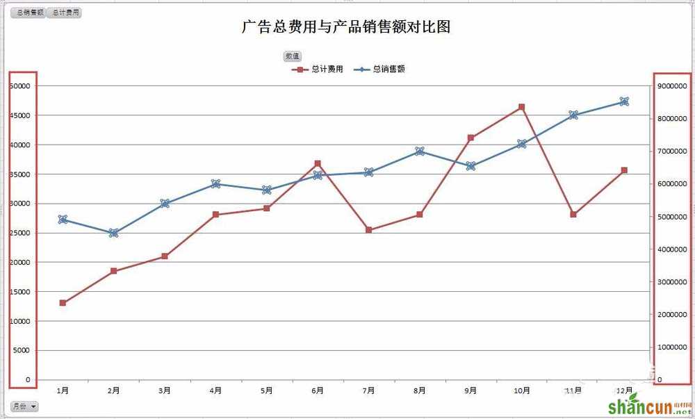
5、现在就变成很漂亮的一个双折线图表。如图下所示:
6、Excel不同的版本操作方式都略有不同,但2010版本做数据图表更方便快捷。