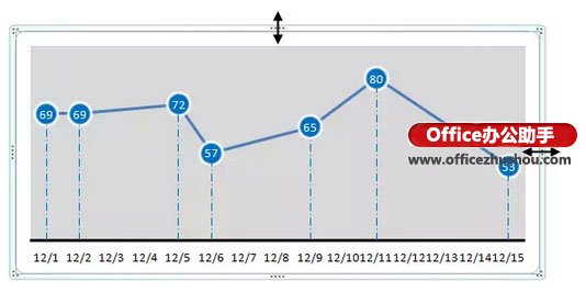
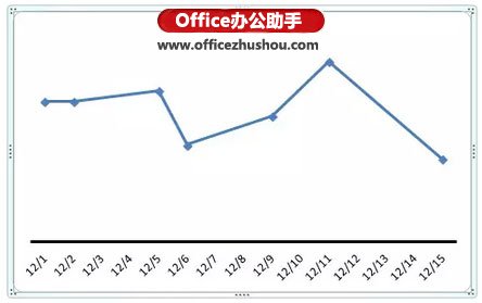
先来看看下面这两个折线图,哪个更漂亮更有档次啊?
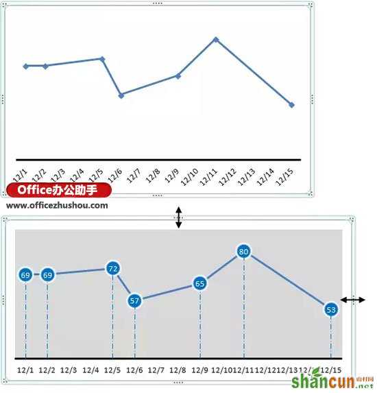
这是使用同一组数据源制作的图表,两者的视觉效果应该不用我多说了吧。接下来,咱们就看看如何实现的吧。
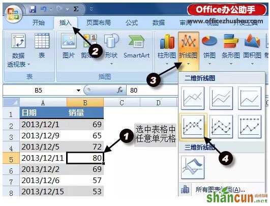
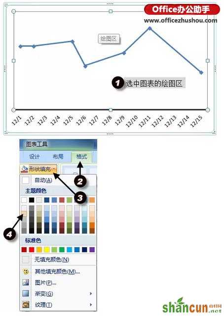
步骤1
首先选中表格中的任意单元格——插入选项卡——折线图——带数据标记的折线图。
步骤2
选中日期坐标轴,右键——设置坐标轴格式
在弹出的设置坐标轴格式对话框中,设置坐标轴主要刻度线类型为无。
点击数字——自定义,在格式代码中输入"m/d",点击添加——关闭
步骤3
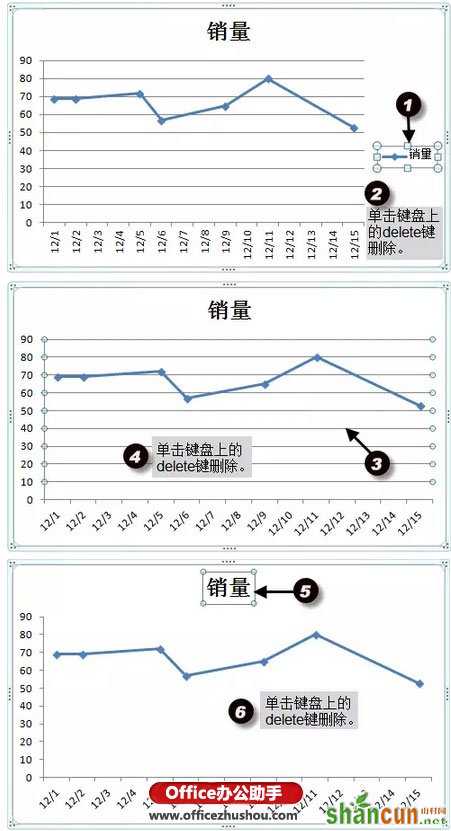
选中图例,然后右键——删除,或者按键盘的delete键删除。同样的方法删除图表网格线和图表标题。
步骤4
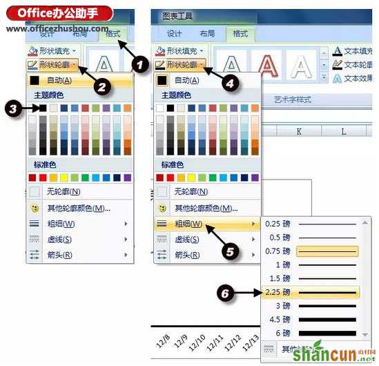
选中日期坐标轴,在图表工具的格式选项卡中,设置形状轮廓为黑色线条,并设置线条粗细为2.25磅。
步骤5
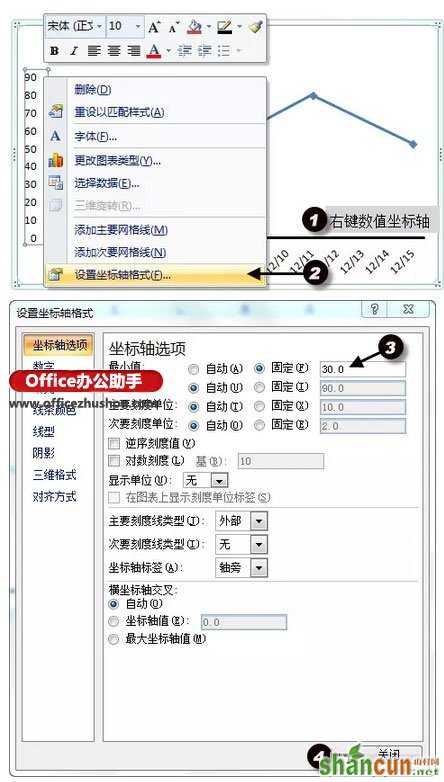
在数值坐标轴处右键——设置坐标轴格式,设置坐标轴最小值为30。再用同样的方法删除数值坐标轴。
步骤6
给绘图区添加浅灰色填充色。
步骤7
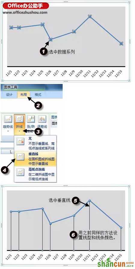
选中数据系列,添加垂直线,并设置垂直线的线型和线条颜色。
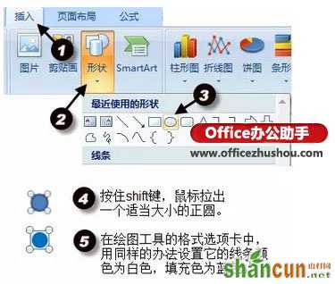
步骤8
接下来就到处理关键的圆形数据标记的时候了。
在插入选项卡中,选择插入一个圆形,然后按住shift键鼠标拖拉出一个正圆。并设置它的形状轮廓为白色,填充色为蓝色。
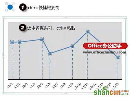
步骤9
接下来,见证奇迹的时刻到了。对那个圆形ctrl+c,选中数据系列,ctrl+v。你懂的~~~
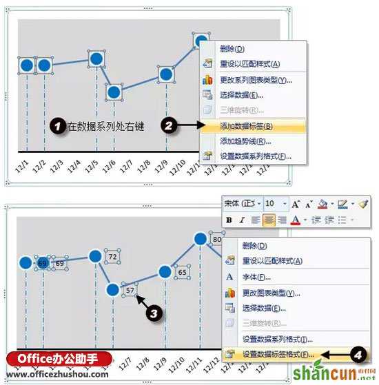
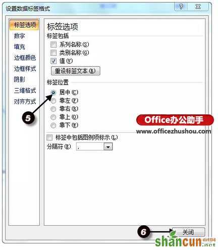
步骤10
最后我们来加上数据标签。在数据系列处右键——添加数据标签。选中所有数据标签,右键——设置数据标签格式——居中——关闭。
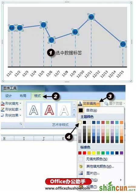
步骤11
选中数据标签,在图表工具的格式选项卡中设置文本填充为白色。
步骤12
适当调整图表区大小。大功告成。