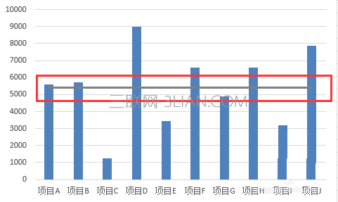
1、如下图,通过制作平均值参考线,能够清楚直观地看出各项目的值与平均值的大小关系。
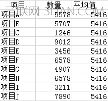
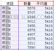
2、首先,在数据源表格中,我们需要添加平均值系列辅助系列。
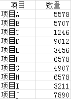
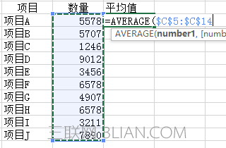
3、在辅助系列单元格中计算出所有项目的平均值。可以按上图的公式计算平均值。
4、删除原来制作的图表,重新选择数据源制作图表,并将平均值系列添加入图表中;
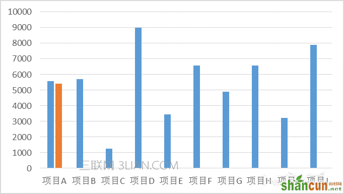
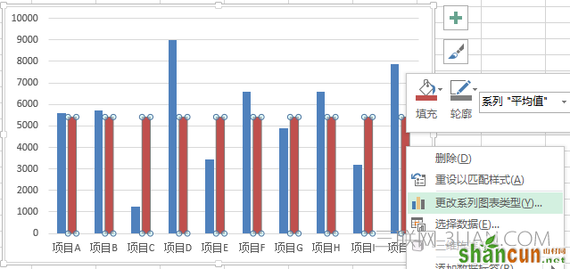
5、插入图表后,会形成如下图所示的图表,平均值系列与项目并列。
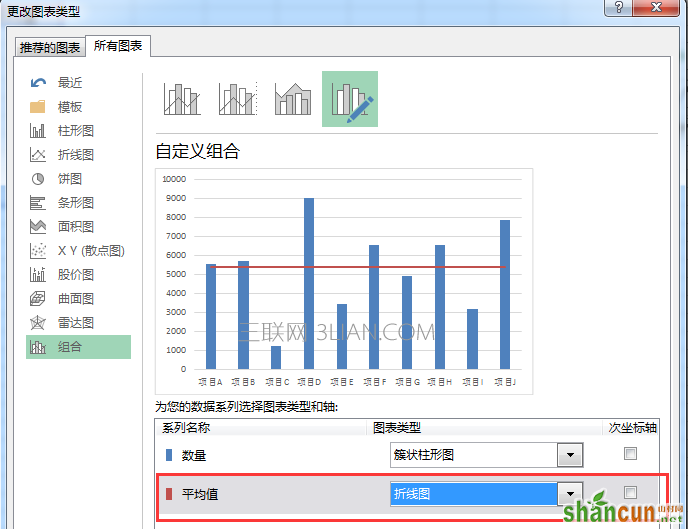
6、在图表中选择平均值系列,点击鼠标右键,选择更改系列图表类型,将簇状柱形图改为折线图,并确定,即完成参考线的绘制。
1、如下图,通过制作平均值参考线,能够清楚直观地看出各项目的值与平均值的大小关系。
2、首先,在数据源表格中,我们需要添加平均值系列辅助系列。
3、在辅助系列单元格中计算出所有项目的平均值。可以按上图的公式计算平均值。
4、删除原来制作的图表,重新选择数据源制作图表,并将平均值系列添加入图表中;
5、插入图表后,会形成如下图所示的图表,平均值系列与项目并列。
6、在图表中选择平均值系列,点击鼠标右键,选择更改系列图表类型,将簇状柱形图改为折线图,并确定,即完成参考线的绘制。

手机看新闻


网站客服
法定工作日
8:30-17:30
微信扫描关注