在创建PPT图表时,有些数据值差异很大,所以需要增加一个次坐标轴,来表现趋势。不仅仅可以添加次坐标,同时更改图表的表现方式也是不错的选择。那么要怎么做呢下面给大家分享ppt表格中插入次坐标轴的方法。
ppt表格中插入次坐标轴的方法
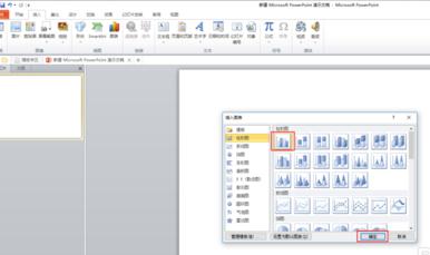
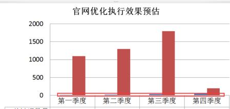
在PPT中插入图表,我暂时定为柱状图,点击确定。
输入图表的相关数据,点击确认。
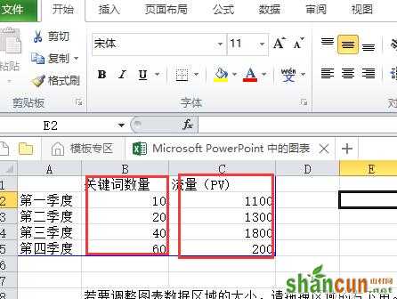
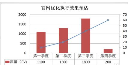
图表的两列数据数值差距比较大,其中一列数据不能很好的表现,看不出变化的趋势。
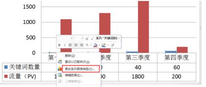
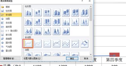
选择变化趋势不大的数据,单击鼠标右键,选择“更改系列图表类型”,点击确认,可以选择适合图表的其他方式图表表现,示例用折线图表示,点击确认。
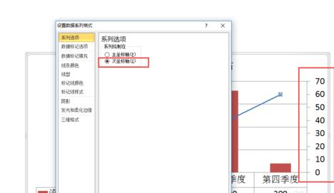
再次单击右键选择最后一列“数值数据系列格式”,选择“次坐标轴”,点击确定即可。