wps表格中制作移动平均线图表的方法:
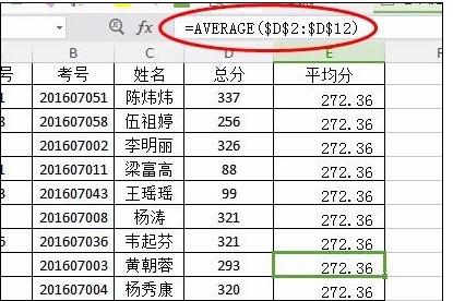
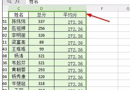
我们先计算了一下平均分,在平均分的那一栏输入函数:=AVERAGE(D2:D12)。
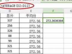
2但是我们要注意如果我们下拉的话平均分是不一样的,因为里面的数据下拉也就是增大,所以我们要把里面的数据锁住,按F4或者是自己加入$也可以的。
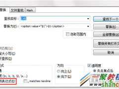
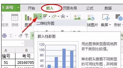
接下来我们就要插入图表了这个时候一定要选中你需要的东西,像标题一定要选中不选择的话坐标就不知道你要是什么料。
选择插入选项卡找到柱形图形插入选择第一个就可以了。
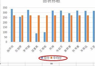
完成之后我们把下面的平均分和总分几个删除掉,我们点击一下平均分总分在按删除键就可以的。
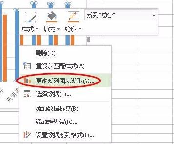
接下来我们点击右键选择更改系列图表类型进入到图像的设置,我们需要更改的是系列名称的是平均分。
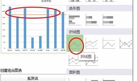
找到下面的设置图表,我们修改第二个平均分的,我们点击图标类型的倒三角选择折线图,我们就可以看到上面变化了。
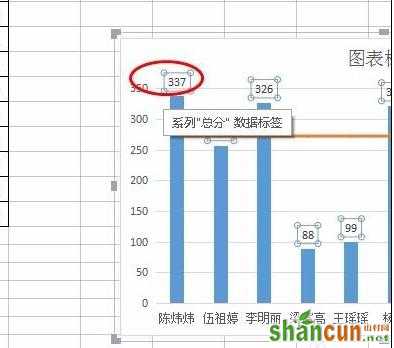
这个时候你也可以拉宽一点名字好看一点,我们在添加一下数据,我们点击右键选择添加数据标签

出来了数据标签之后我们点击一个数字就会选中所有的,在调整一下大小和颜色都是在开始选项卡下面我们调字体的地方。
平均分的这条线添加数据标签的时候我们就要注意了,先点击一次折线再点击一次就会值选中一个数据标签这个时候我们在添加数据标签就只有一个的。
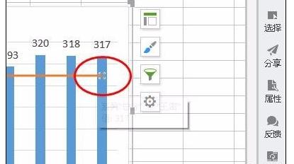
同样的我们设置一下大小这个时候我们在点击右键里面的设置数据标签格式,把标签位置设置为靠下。

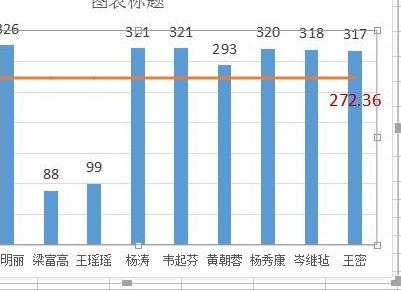
最后我们也可以设置柱形的宽度和数据标签的大小颜色等等都是可以,下面我们看下完成的图表如下图所示。