使用CSS Sprite技术,利用一个初始图片和一张画满各个动作的拼接图片,从而实现了动画效果。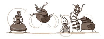
首先,需要两张图,分别是:
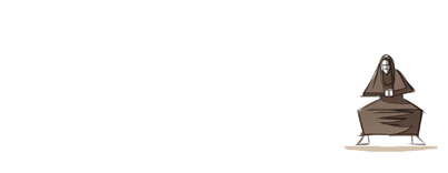
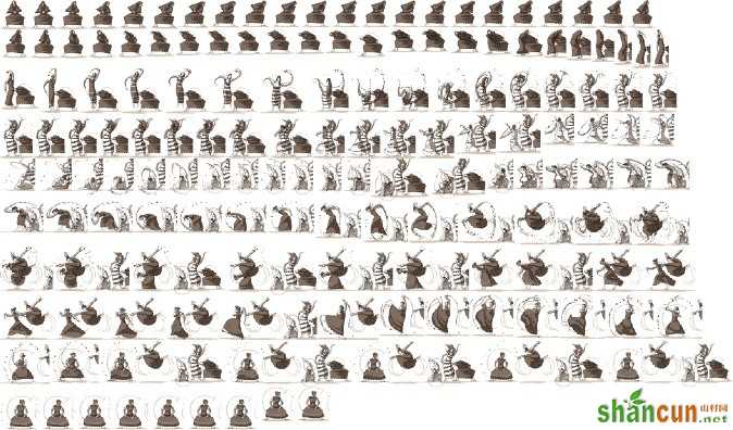
当有这两张图后,我们就可以开始模拟了。
我先通过firebug观察,发现google首页在运行的时候会循环加载以下html代码:
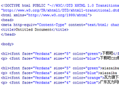
<div id="hplogo0" style="left:307px;top:48px;width:88px;height:89px;background:url(http://www.google.com.hk/logos/2011/graham11-hp-sprite.png) no-repeat scroll 0px 0px transparent;"></div> <div id="hplogo1" style="left:307px;top:48px;width:89px;height:89px;background:url(http://www.google.com.hk/logos/2011/graham11-hp-sprite.png) no-repeat scroll -88px 0px transparent;"></div> <div id="hplogo2" style="left:307px;top:48px;width:91px;height:89px;background:url(http://www.google.com.hk/logos/2011/graham11-hp-sprite.png) no-repeat scroll -177px 0px transparent;"></div> <div id="hplogo3" style="left:305px;top:49px;width:93px;height:89px;background:url(http://www.google.com.hk/logos/2011/graham11-hp-sprite.png) no-repeat scroll -268px 0px transparent;"></div> <div id="hplogo4" style="left:305px;top:50px;width:93px;height:88px;background:url(http://www.google.com.hk/logos/2011/graham11-hp-sprite.png) no-repeat scroll -361px 0px transparent;"></div> <div id="hplogo5" style="left:305px;top:50px;width:93px;height:88px;background:url(http://www.google.com.hk/logos/2011/graham11-hp-sprite.png) no-repeat scroll -454px 0px transparent;"></div> <div id="hplogo6" style="left:306px;top:52px;width:92px;height:86px;background:url(http://www.google.com.hk/logos/2011/graham11-hp-sprite.png) no-repeat scroll -547px 0px transparent;"></div> <div id="hplogo7" style="left:305px;top:53px;width:93px;height:84px;background:url(http://www.google.com.hk/logos/2011/graham11-hp-sprite.png) no-repeat scroll -639px 0px transparent;"></div> <div id="hplogo8" style="left:305px;top:54px;width:94px;height:83px;background:url(http://www.google.com.hk/logos/2011/graham11-hp-sprite.png) no-repeat scroll -732px 0px transparent;"></div> <div id="hplogo9" style="left:306px;top:54px;width:93px;height:83px;background:url(http://www.google.com.hk/logos/2011/graham11-hp-sprite.png) no-repeat scroll -826px 0px transparent;"></div> <div id="hplogo10" style="left:307px;top:54px;width:92px;height:83px;background:url(http://www.google.com.hk/logos/2011/graham11-hp-sprite.png) no-repeat scroll -919px 0px transparent;"></div> <div id="hplogo11" style="left:307px;top:54px;width:92px;height:83px;background:url(http://www.google.com.hk/logos/2011/graham11-hp-sprite.png) no-repeat scroll -1011px 0px transparent;"></div> <div id="hplogo12" style="left:308px;top:54px;width:90px;height:83px;background:url(http://www.google.com.hk/logos/2011/graham11-hp-sprite.png) no-repeat scroll -1103px 0px transparent;"></div> ... ... 实际上这就是实现动画效果的因素,但我发现,我可以循环生成,但是我无法循环生成每个div里的样式,因为样式的宽高、偏移像素都是无规律的,所以我的做法就是,把谷歌生成好的代码复制过来,然后默认全部隐藏,然后循环让其显示出来。
原理就是这样,js的实现也更为简单,所以我就没用jquery,以下是js实现代码:
var i=0; window.setInterval(google,83); function google(){ if(i<=154){ var logo = document.getElementById("hplogo"+i); logo.style.display = 'block'; } i++; } 源码下载