自适应布局在实际应用中越来越普遍了,今天分享几个自适应布局的demo,主要是浮动圣杯布局(也叫双飞翼布局,主要是利用浮动和margin负边距实现的),没有介绍绝对定位布局,都是我想,你能明白我下面的几个例子,绝对定位布局也是非常的简单了。
PS:圣杯布局有个好处,符合前端开发中渐进增强的理念,因为浏览器解析是从DOM的上至下,圣杯布局能够把页面中重要的内容section放到DOM前面先解析,而次要的aside内容则放在DOM后面后解析。
下面的例子能够解决实际应用中绝大多数的自适应布局问题了,有兴趣的童鞋可以研究下,代码如下:
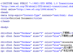
1.左边固定,右边自适应(圣杯布局的实现):
<!DOCTYPE HTML>
<html>
<head>
<meta http-equiv="Content-Type" content="text/html; charset=utf-8">
<title>无标题文档</title>
<style type="text/css">
body{margin:0;padding:0}
.wrap{ width:100%; float:left}
.content{ height:300px;background:green; margin-left:200px}
.right{ width:200px; height:300px; background:red; float:left; margin-left:-100%}
</style>
</head>
<body>
<div class="wrap">
<div class="content">content</div>
</div>
<div class="right">aside</div>
</body>
</html>
2.右边固定,左边自适应(圣杯布局的实现):
<!DOCTYPE HTML>
<html>
<head>
<meta http-equiv="Content-Type" content="text/html; charset=utf-8">
<title>无标题文档</title>
<style type="text/css">
body{margin:0;padding:0}
.wrap{ width:100%; float:left}
.content{ height:300px;background:green; margin-right:200px}
.right{ width:200px; height:300px; background:red; float:left; margin-left:-200px;}
</style>
</head>
<body>
<div class="wrap">
<div class="content">content</div>
</div>
<div class="right">aside</div>
</body>
</html>
3.左边和右边固定,中间自适应:
<!DOCTYPE HTML>
<html>
<head>
<meta http-equiv="Content-Type" content="text/html; charset=utf-8">
<title>无标题文档</title>
<style type="text/css">
body{margin:0;padding:0}
.wrap{ width:100%; float:left}
.content{ height:300px;background:green; margin-left:200px;margin-right:200px}
.left{ width:200px; height:300px; float:left; background:yellow; margin-left:-100%}
.right{ width:200px; height:300px; background:red; float:left; margin-left:-200px}
</style>
</head>
<body>
<div class="wrap">
<div class="content">content</div>
</div>
<div class="left">aside</div>
<div class="right">aside</div>
</body>
</html>